Mid-Program Review: Reporting Wrap-Up
UX/Ui | Product Manager | HTML | CSS
The objective was to develop a fun, Spotify Wrapped-style report for participants in Butler/Till’s Digital Content Program, spanning 6 to 12-month programs. As the lead UX/UI team member, doubling as a Product Manager, I was responsible for writing requirements and creating designs. I was able to provide light assitance with the intial creation of the SendGrid template code, before it was passed along to our cross-functional team that would implement the code. This project encompassed two programs and products within the Butler/Till organization required clear communication and understanding of how all platforms would communicate,
The Challenge
Engage users at the midpoint of their Digital Content Program, highlighting key achievements to encourage re-enrollment for another 6-12 months.
Data Discovery & Ideation
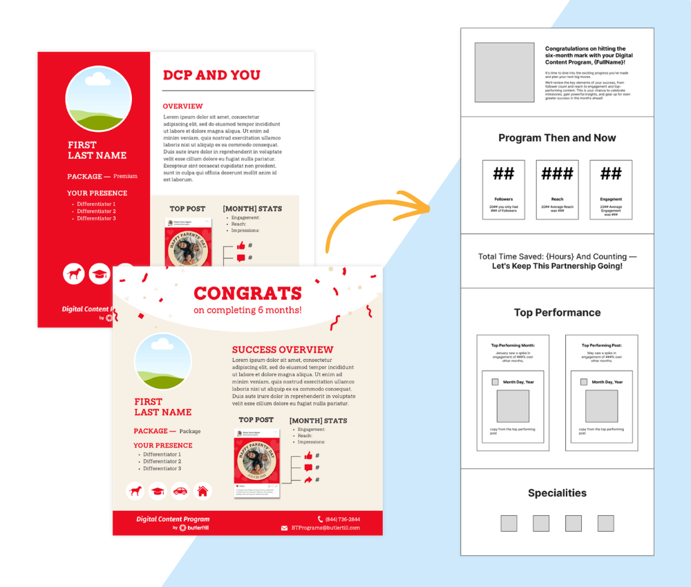
The ask from our clients and stakeholders was clear, and luckily, users were already engaging with a similar report. We were able to gather feedback from users and stakeholders, and after some review, we were able to identify three meaningful metrics to our users and client: Followers, Reach, and Engagement. We consistently heard our users asking “how many followers have I gained since beginning the program…who is seeing my content…how many likes am I getting?” It was clear that these metrics were of value and needed to be emphasized to users purposefully and to stand out from the rest of the noise in their monthly reporting.
Some items from the previous report worked, such as showing top-performing posts for each month, while others did not. It became clear that the focus of a majority of users was not on how they stood apart from colleagues, but rather, the focus was on them at all.
Our report still needed more that stood out; we needed to really add value to our program to show our users why they should continue with us. After brainstorming a few different ideas, we kept coming back to a consistent comment from users: “I don’t have time for…” So, why not tell them the time they are saving as a value-add?
We saw an opportunity to keep users engaged and wanting to renew their program, hoping that they would be impressed with their program’s success and want to instantly renew. To capitalize on this excitement, we needed to incorporate a "renew now" feature into the email to direct users back to our enrollment site. Ultimately, though, this was proven to be too complex due to the nature of user IDs, so we were unable to bring it to fruition.
With all of this in mind, a basic wireframe was created and presented to stakeholders for approval before proceeding.
Creative Concepting
Once the wireframes were approved, we could start putting visuals together in Figma. The uniqueness of this project was that we were allowed to utilize our agency's branding, which was not something we had done before for anything going directly to this client’s users. With this, it was allowing our agency to further establish itself to this user group as a reputable brand for their marketing needs.
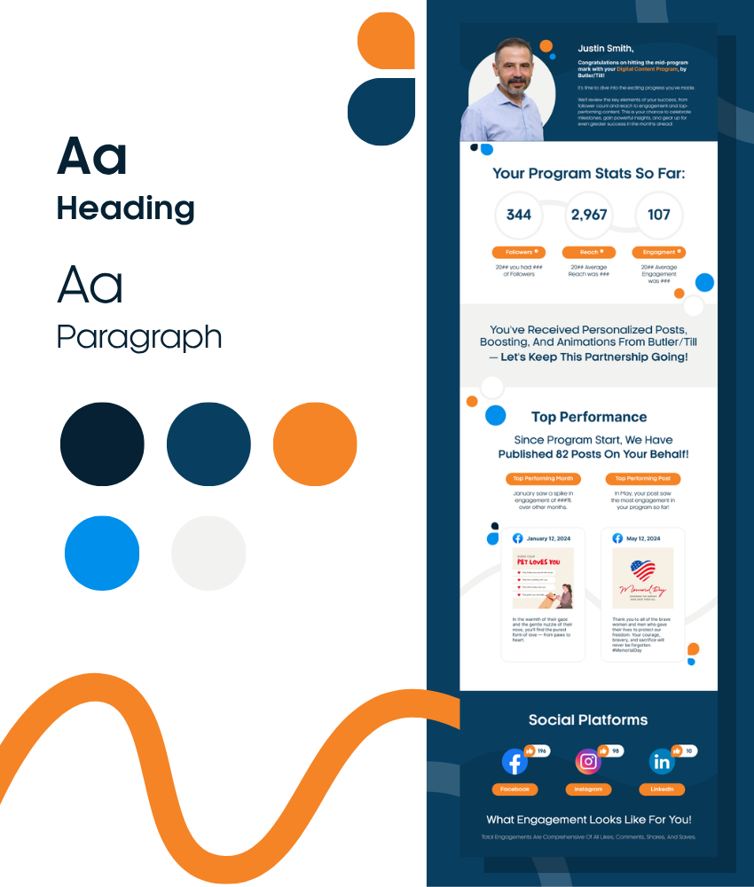
Because the report was intended to be engaging rather than purely informational, the content and visual design were developed together. While the copy informed the visual direction, the design amplified the messaging, creating a cohesive experience that encouraged users to continue exploring their results.
Drawing from Butler/Till's visual identity, I incorporated playful geometric shapes, bold typography, and intentional uses of color to establish a sense of energy while guiding users through the report. Color wasn't used solely for aesthetics. It created visual hierarchy, highlighted key insights, and directed attention to the most important information, making the report easier to scan and understand.
DEVELOPMENT HANDOFF & QA
Following the completion of the final designs, I worked with our engineering vendor team to translate the creative concepts into a fully functional email campaign within SendGrid. This required close communication throughout development to ensure the intended user experience, visual details, and interactions were accurately represented within the technical constraints of the platform.
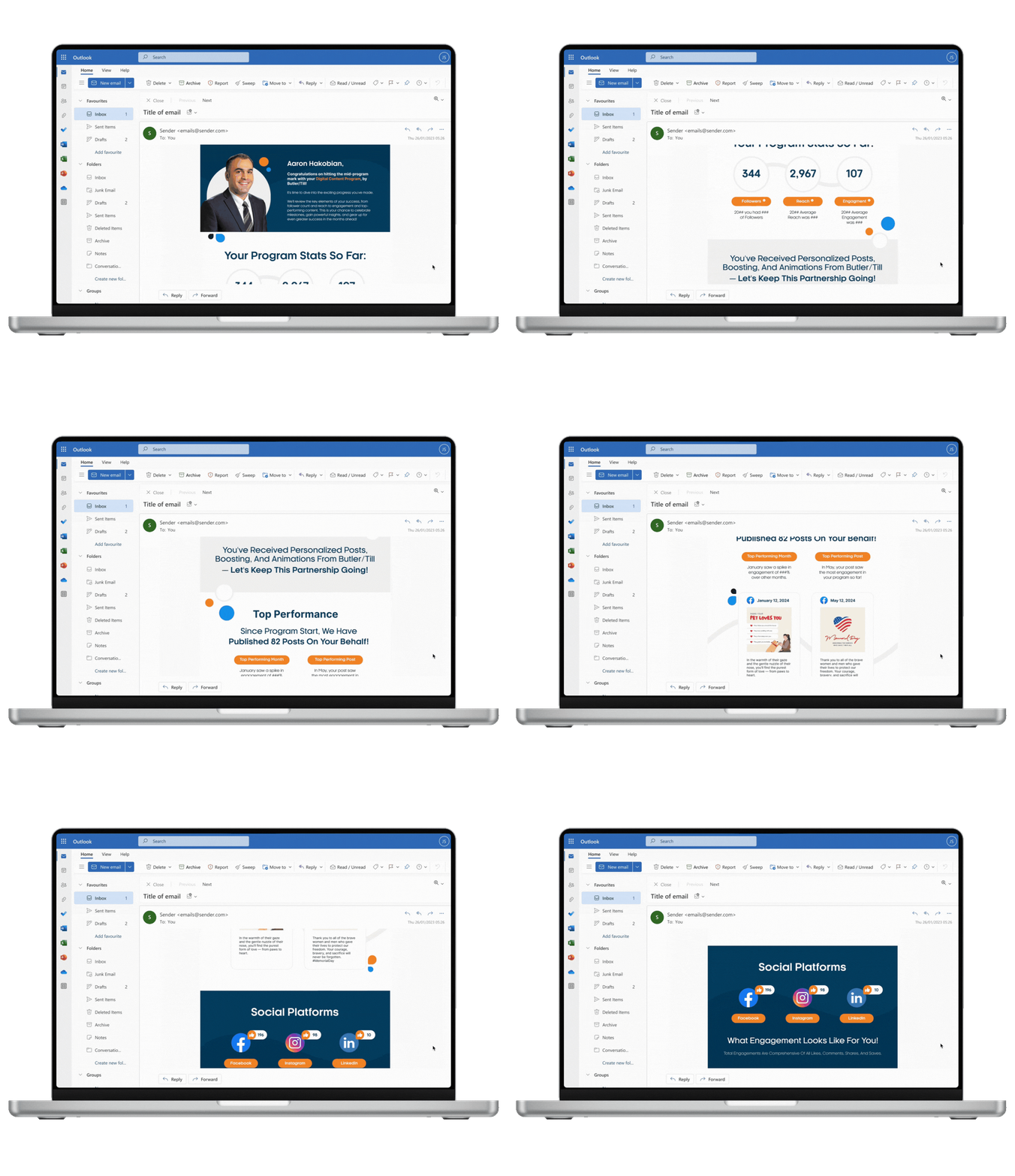
Given the project's tight sprint timeline and limitations within the email environment, I worked alongside the development team to identify practical solutions while preserving the overall design vision. Because the client’s requirements limited usage to approved desktop devices, our QA process focused specifically on validating the experience within Outlook on Mozilla Firefox.
During QA, I prioritized data accuracy, consistency with Butler/Till’s brand guidelines, and maintaining a clear, engaging experience for users. I also documented opportunities for future iterations, including potential content improvements such as preventing duplicate top-performing statistics and refining the overall flow of information for future campaigns.
Final Outcome
The final Mid-Program Review email successfully combined playful visuals and key user stats within the client’s approved platform restrictions. Careful QA ensured clarity, accuracy, and on-brand engagement. This project reinforced the importance of balancing creativity, technical constraints, and user delight. Here are some additional points to consider:
Key Takeaways:
The project demonstrated the ability to translate complex data into an engaging and user-friendly format
It highlighted the importance of thorough planning and attention to detail, particularly when working within specific platform limitations
The successful outcome shows how creativity and technical constraints can coexist to create a positive user experience
The project also underscored the value of collaboration and clear communication within a cross-functional team